
Visual Identity
Art Direction
Social movement
● Cicla
06 of 10
Capture the strength of the female community, supporting each woman on her personal journey.
2024
Cicla is a women’s cycling club that organizes exclusive rides for its members, combining physical activity, personal growth, and community. Its visual identity draws inspiration from the journey, trails, and roads, symbolizing movement, effort, and discovery at every stage.
Each graphic element reinforces closeness, dynamism, and the connection among participants, creating a coherent visual language that conveys authenticity, strength, and a sense of belonging, supporting women through every experience of exploration and personal growth.
Routes, growth,
and community.
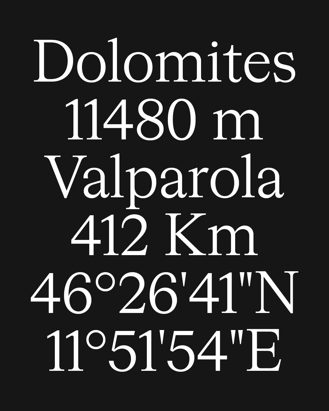
The visual identity evokes the classic signage of roads and trails, symbolizing the spirit of exploration, the strength of the community, and personal growth.
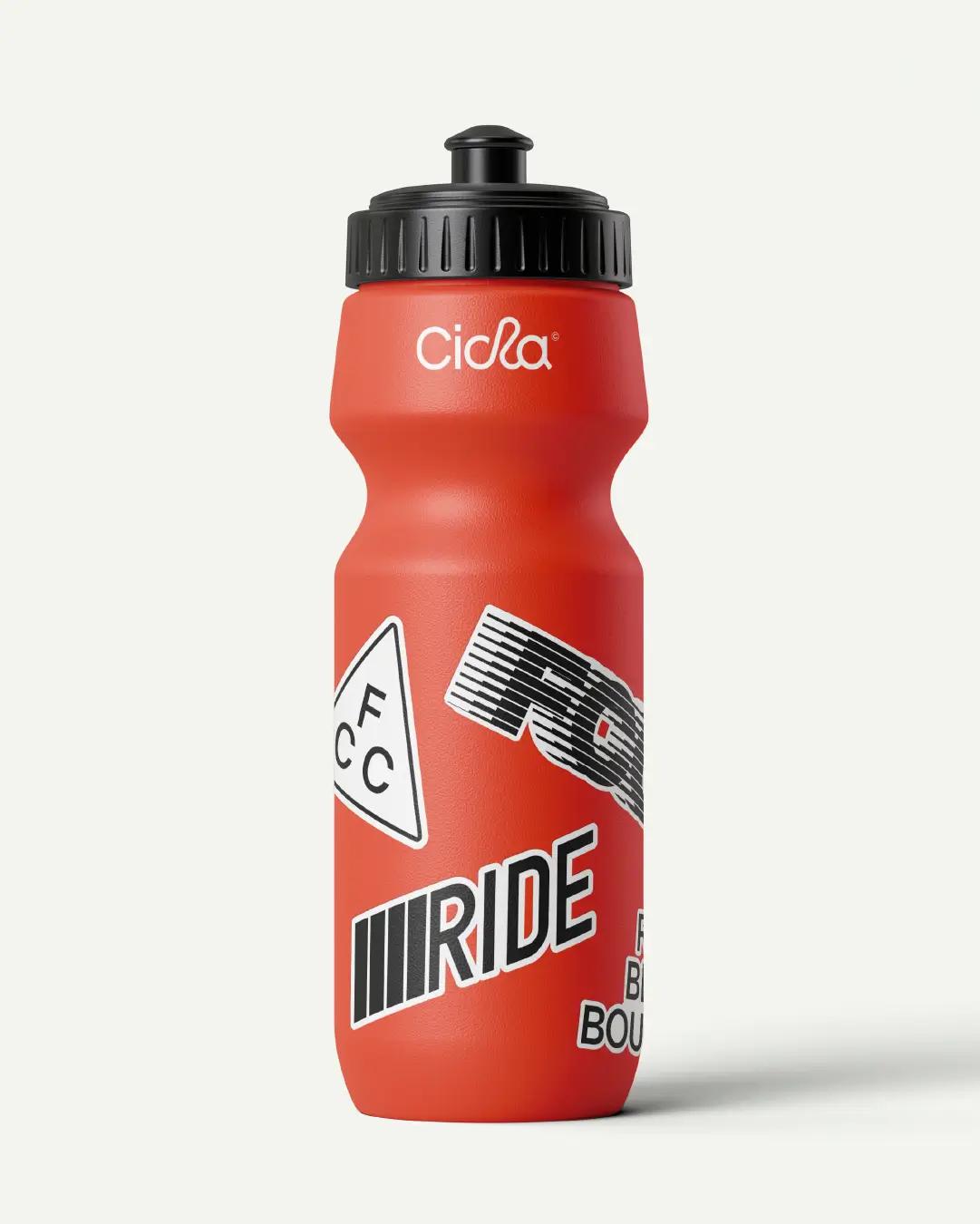
Additionally, the graphics are inspired by the iconic stickers found on trail posts, designed as personal emblems representing goal achievement.

The main strength of the identity is the dynamism of its graphics, which are highly adaptable across multiple platforms and media, demonstrated in the use of the most distinctive elements of the cycling world.
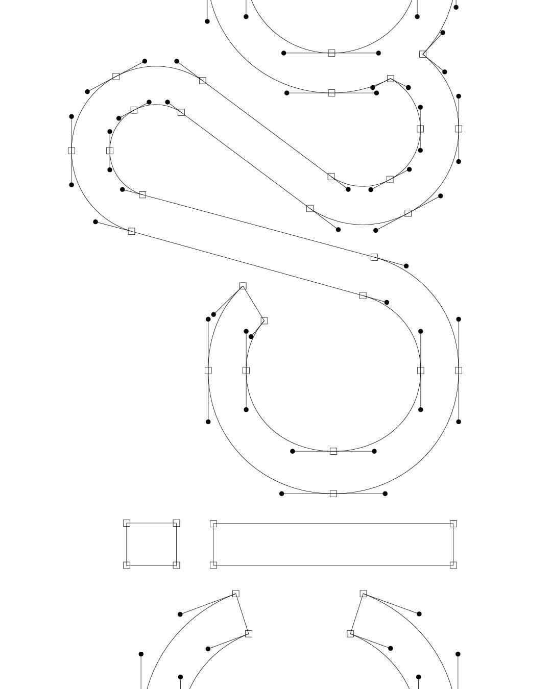
Through the fusion of the palette, typography, and compositions, we aimed to convey flexibility, authenticity, and connection, creating a clear and engaging identity that invites women to feel part of an active and empowered community.



Values