Packaging
Visual Identity
Artisanal food
● Perusiñas
05 of 10
Combine craftsmanship, flavor, and design to create a visually distinctive brand.
2025
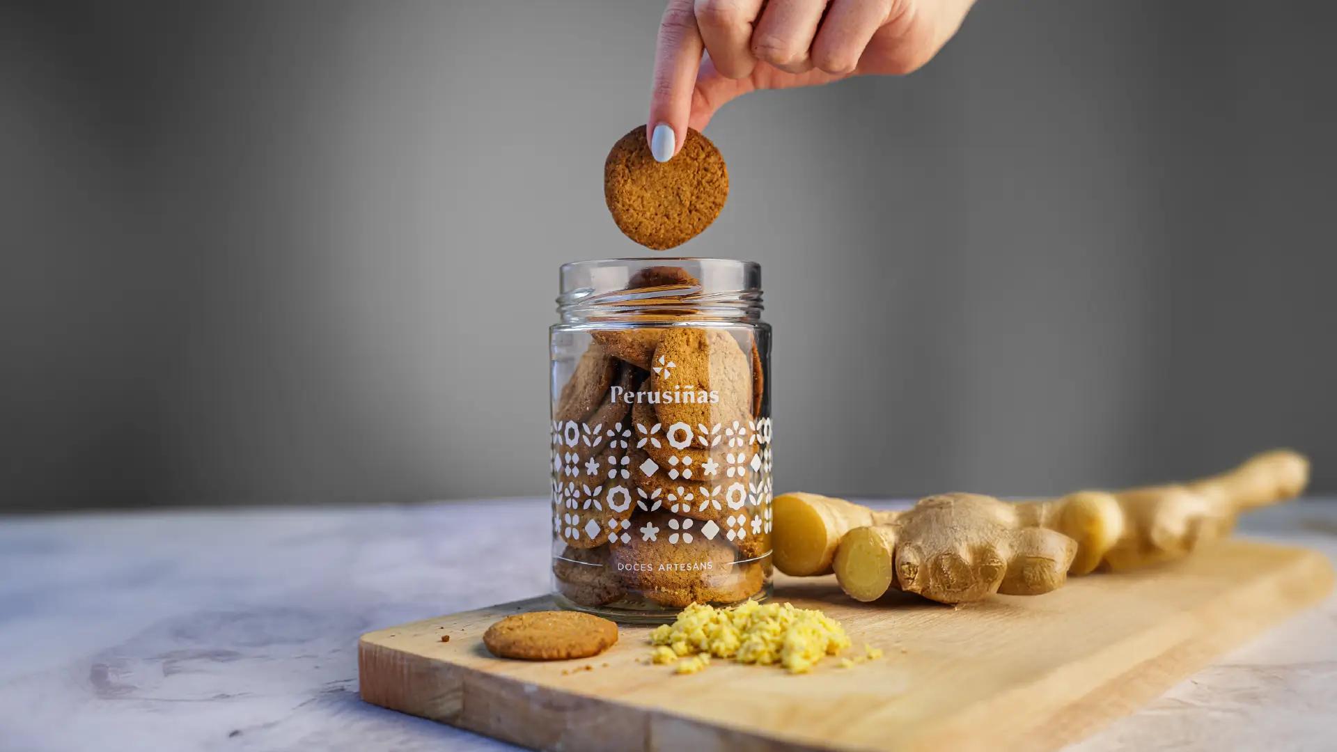
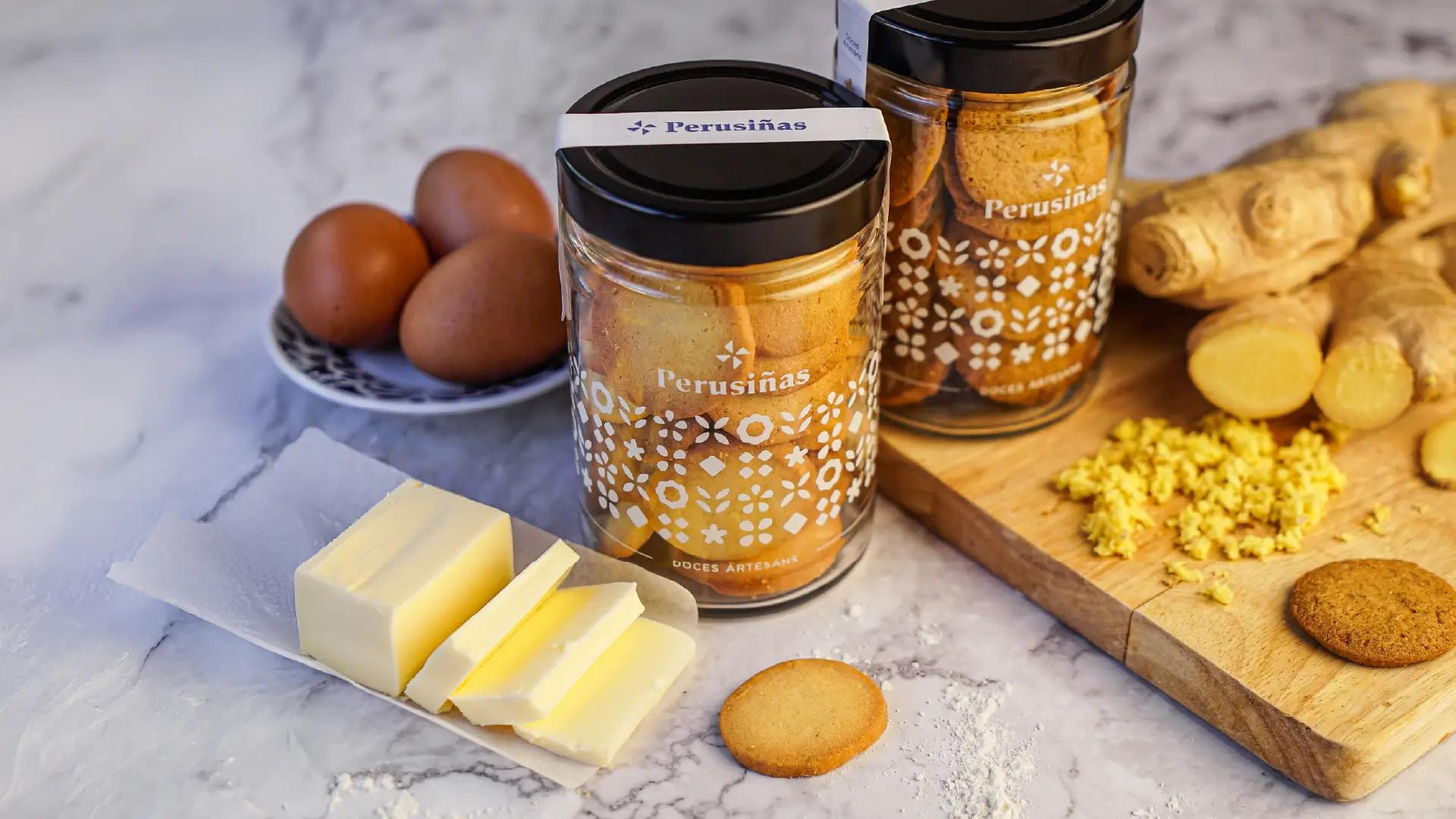
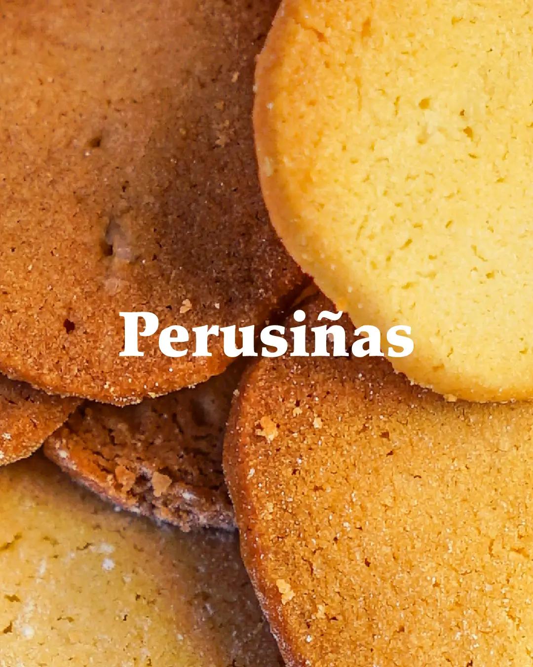
Perusiñas is a brand of gourmet, artisanal cookies produced in Lugo, Galicia. We developed the visual identity and packaging design for its four flavors: butter, ginger, cinnamon, and lemon, distinguished by geometric patterns inspired by the work of Isaac Díaz Pardo.
The proposal arose from the need to communicate a high-quality artisanal product, accompanied by reusable packaging and an attractive, recognizable, and approachable design, achieving a balance between Galician tradition and the flavor of this iconic family project.
A language
for each flavor.
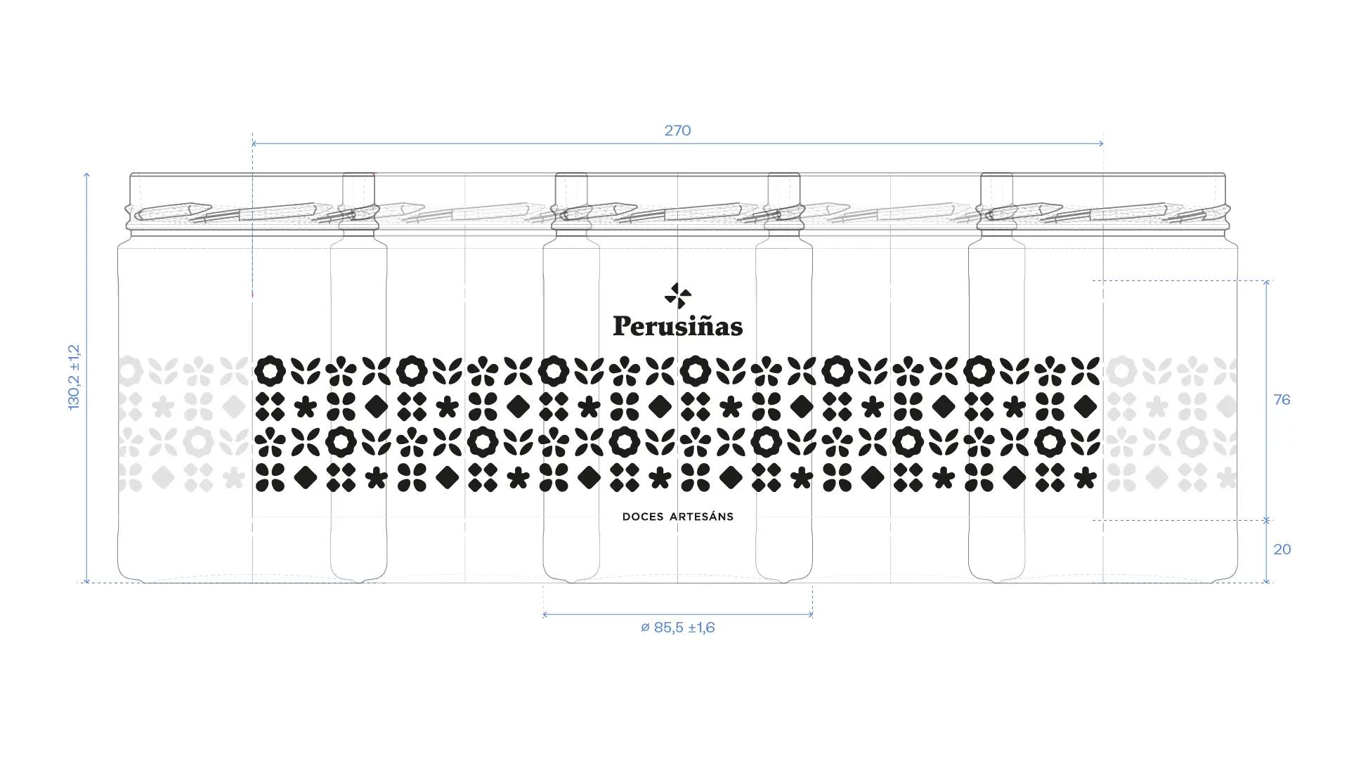
Each flavor features its own geometric pattern, with each element representing its main ingredients in a simplified form.
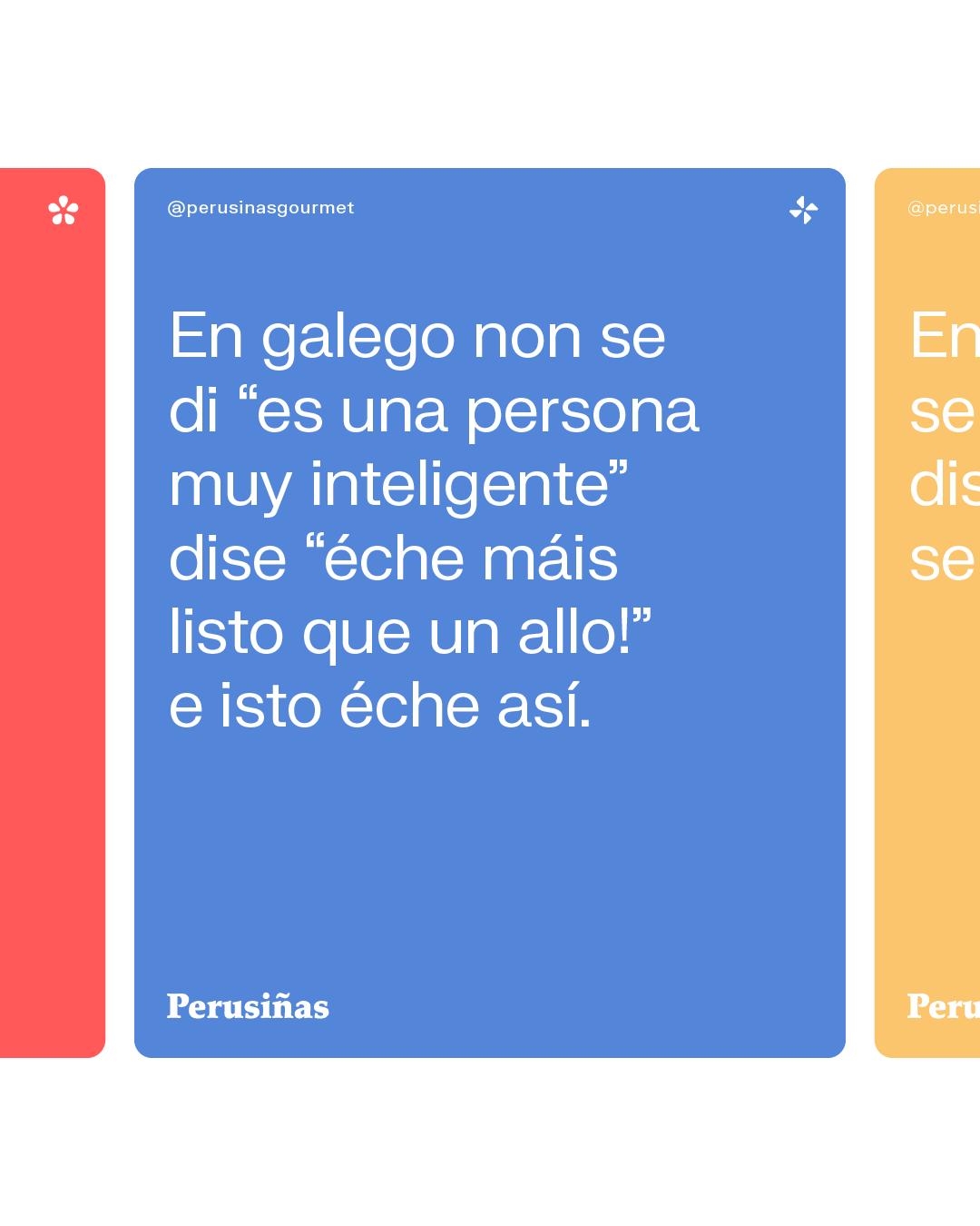
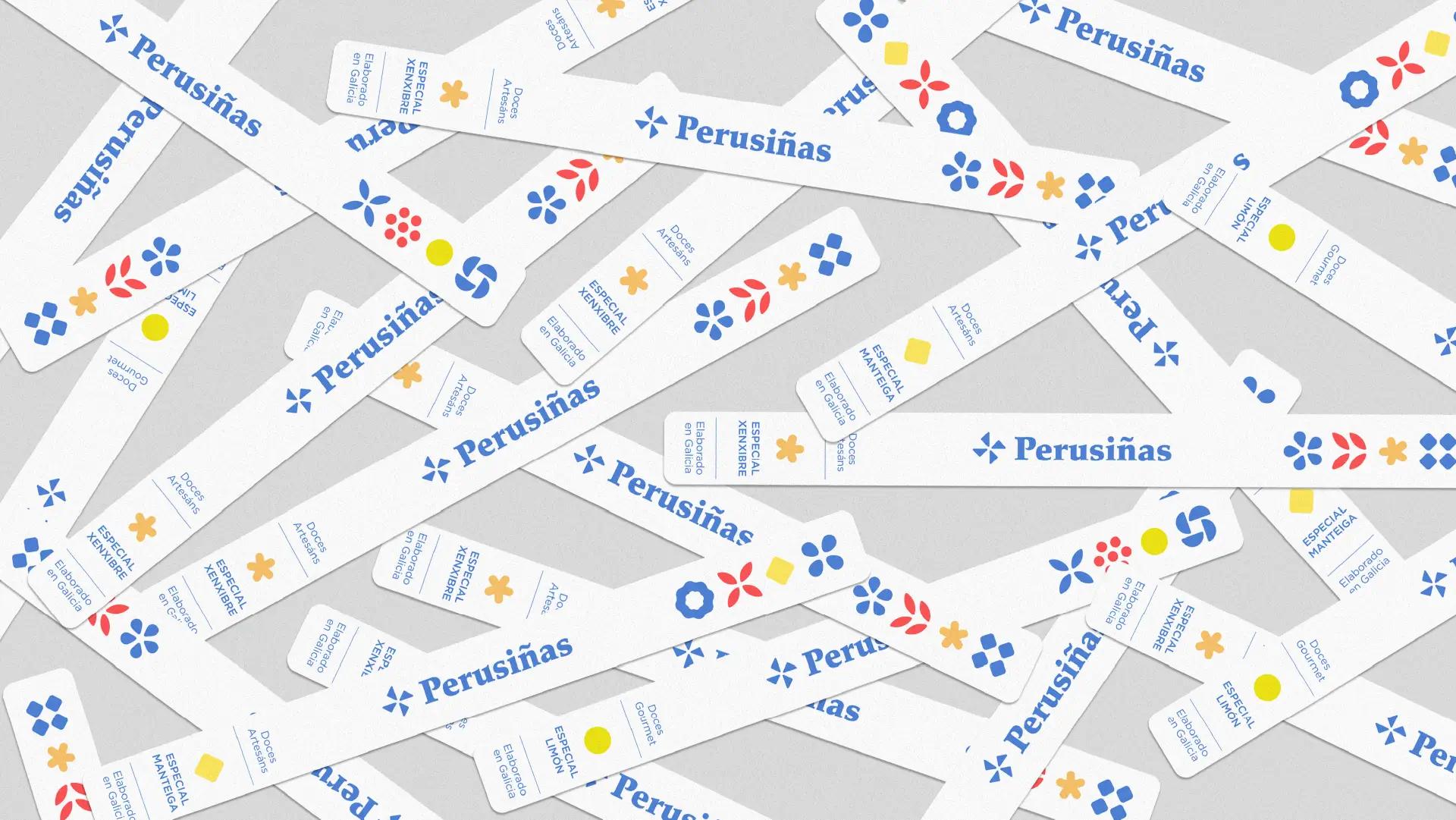
These are reflected in Perusiñas’ main color palette, composed of red and blue, while the distinctive color of each flavor serves as a focal point and differentiating element.
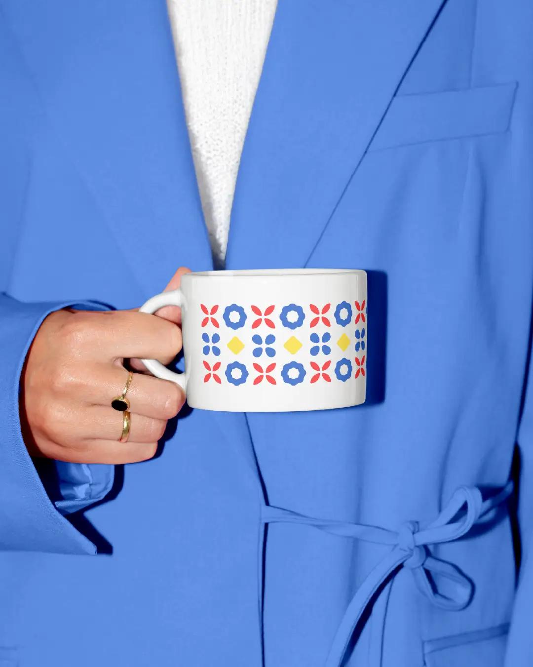
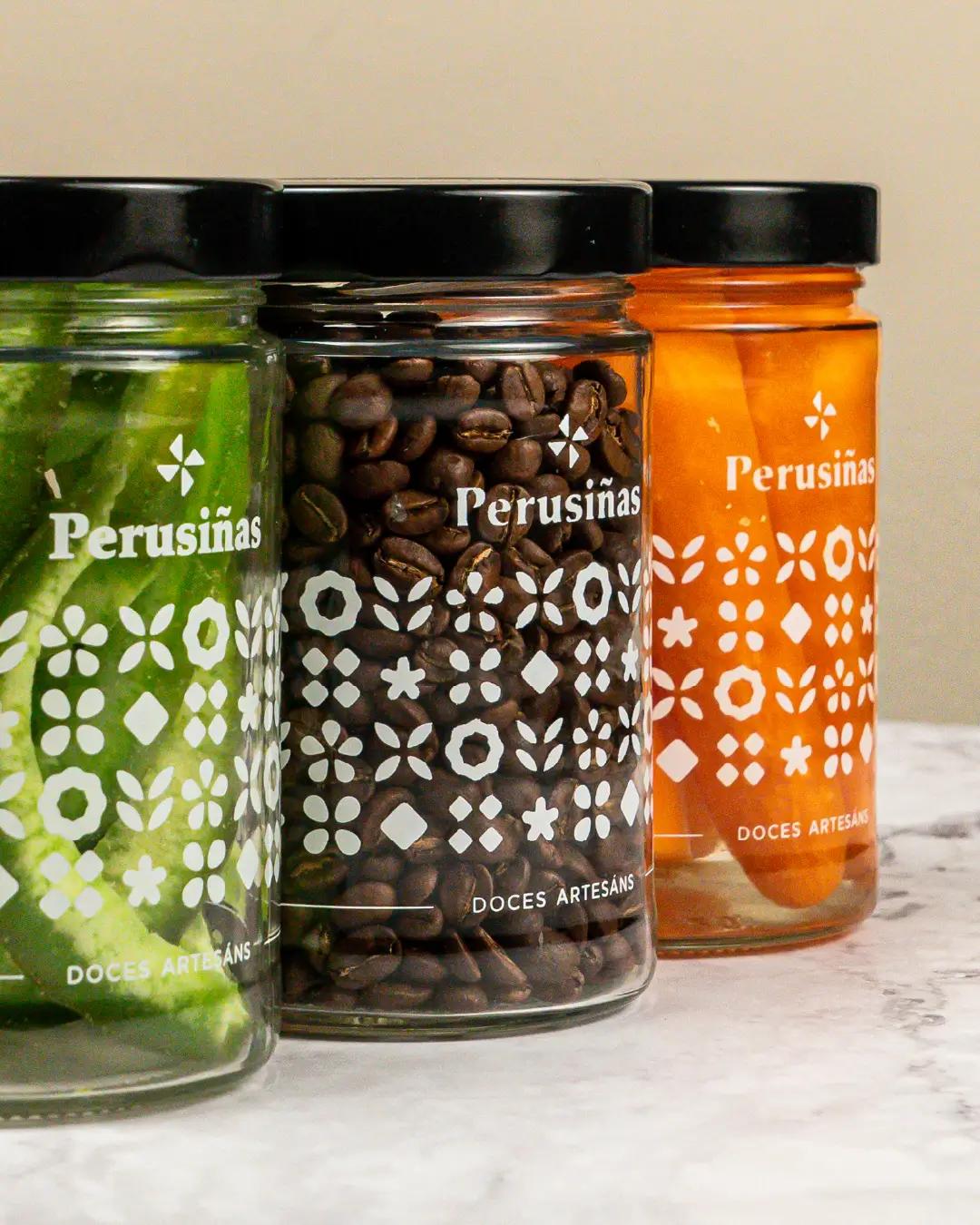
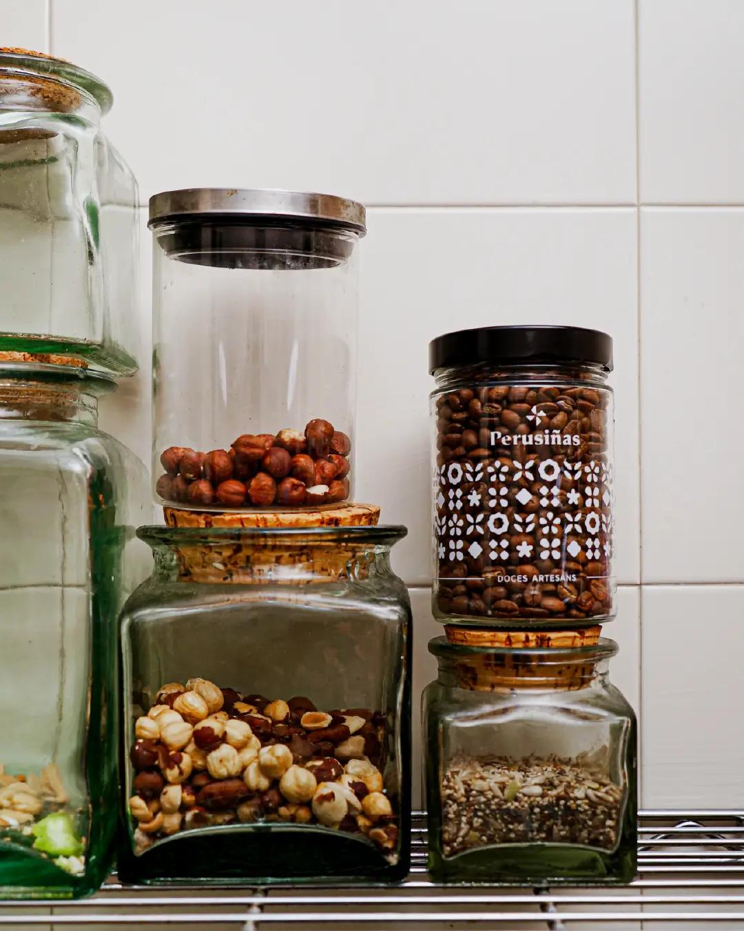
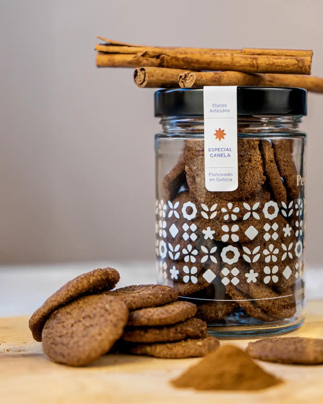
One of the main challenges was to design a packaging that, besides being visually appealing, could be reused and spark the audience’s interest in keeping it. For this reason, a glass jar was chosen, printed using white screen printing to create a contrast with the cookies inside.
This choice allowed the color to be applied to the security seals in a simple and functional way. The result is a consistent identity that combines tradition, flavor, and contemporary design, visually conveying the freshness, aromas, and sensory experience of each product.

Values